This is part 3 of my Complex Component Design series. Here are the preceding posts:
- Intro
- Part 1 - Analyzing User Flows
- Part 2 - Towards a more reactive component
- Part 3 - Replace the observer
- Part 4 - Use the hash helper
You can find the code for this post on Github.
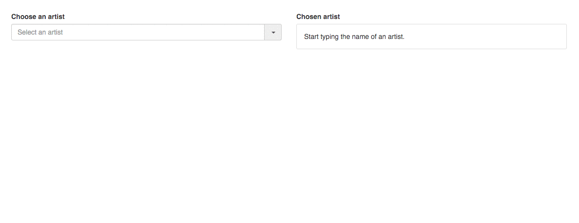
In the last post, we refactored towards a more reactive component and got pretty far. However, we established that we’d still have to remove the observer that was also causing a weird bug:
Event origin and data owner components are different
The reason we introduced an observer was that we wanted to trigger an action
when one of the options was selected via cycling through them and hitting the
return key on the focused option. Since the necessary data for that event was
contained in the auto-complete-option component but the source of the keyboard
event was the auto-complete component, we couldn’t simply trigger the action
with the right data from the event source.
We fixed this by using an observer so that even though the event that
should trigger the action was fired “upstream”, in the auto-complete
component, we could react to this change “downstream”, in the appropriate
auto-complete-option whose isSelected property became true:
1 2 3 4 5 6 7 8 9 10 11 12 13 14 15 16 17 18 | |
Our analysis of the cause already hints at the solution. We could move the
knowledge of which option is selected up to the auto-complete component and
then, when the user hits the return key to select the focused option, trigger
the action with the data that we have at our disposal.
Centralized power in auto-complete
Changes in components
We will maintain the selected option in auto-complete and trigger the
selectItem action when one of them is selected via a return key event (I
skipped the code snippet that calls selectOption for return):
1 2 3 4 5 6 7 8 9 10 11 12 13 14 15 16 17 18 19 | |
On line 11, we call the selectOption action (renamed from selectItem) with
the (new) selected option. selectedOption is simply the option that has the
selectedIndex.
Independently of the current selectOption refactor, let’s fix a nasty
bug by making sure to reset the focusedIndex when the input changes:
1 2 3 4 5 6 7 8 9 10 11 12 13 | |
Next, let’s look at how the selectOption action needs to change:
1 2 3 4 5 6 7 8 9 10 11 12 13 14 15 16 17 18 19 20 | |
One of the things that has changed is that it now only receives one argument,
option as the label of the option can now be computed internally, from within
the component.
That means that the label now does not need to be passed to the
auto-complete-option components and that its action that gets triggered when
the user clicks on it needs to be adjusted:
1 2 3 4 5 6 7 8 9 10 11 12 13 14 15 16 17 | |
You can see I removed the observer and that I only send the item (not the label,
see the very first code example) in the action handler to comply with the new
API of the selectOption action.
Changes in templates
Let’s see how the templates need to change to accommodate that change.
First of all, the template of the auto-complete component needs to yield the
options to be consumed downstream. Let’s also not forget to rename
selectItem to selectOption:
<!-- addon/templates/components/auto-complete.hbs -->
{{yield isDropdownOpen
        inputValue
        options
        focusedIndex
        selectedIndex
        (action "toggleDropdown")
        (action "selectOption")
        (action "inputDidChange")}}
Then, the each loop should iterate through options, and not through
matchingArtists as before:
<!-- tests/dummy/app/templates/index.hbs -->
{{#auto-complete
      on-select=(action "selectArtist")
      on-input=(action "filterArtists")
      options=matchingArtists
      displayProperty="name"
      class="autocomplete-container" as |isDropdownOpen inputValue options
                                         focusedIndex selectedIndex
                                         toggleDropdown onSelect onInput|}}
  <div class="input-group">
    {{auto-complete-input
        value=inputValue
        on-change=onInput
        type="text"
        class="combobox input-large form-control"
        placeholder="Select an artist"}}
    {{#auto-complete-list
        isVisible=isDropdownOpen
        class="typeahead typeahead-long dropdown-menu"}}
      {{#each options as |option index|}}
        {{#auto-complete-option
            item=option
            on-click=onSelect
            isFocused=(eq focusedIndex index)
            isSelected=(eq selectedIndex index)}}
          <a href="#">{{option.name}}</a>
        {{/auto-complete-option}}
      {{else}}
        <li><a href="#">No results.</a></li>
      {{/each}}
    {{/auto-complete-list}}
    {{#auto-complete-dropdown-toggle on-click=toggleDropdown class="input-group-addon dropdown-toggle"}}
      <span class="caret"></span>
    {{/auto-complete-dropdown-toggle}}
  </div>
{{/auto-complete}}
The bug at the beginning of the post is now gone:
In the next episode…
We now have a working, state-of-the-art component design with no coupling
between the sub-components and no observers. One thing that is not ideal,
though, is the number of parameters the auto-complete components yields (see
last code snippet).
Just as you wouldn’t have a method with 7 or 8 positional parameters, you don’t
want a component that yields that many properties matched by position. So in the
next installment of this series, we’ll use the hash helper to transform that
long list into keyed parameters.