This is part 2 of my Complex Component Design series. Here are the posts in the series:
- Intro
- Part 1 - Analyzing User Flows
- Part 2 - Towards a more reactive component
- Part 3 - Remove the observer
- Part 4 - Use the hash helper
In the previous part of this series, the implementation of the main user flows were explained in detail. I ended the post by saying that I was not content with the implementation for several reasons, the most crucial of which was that parent components needed to be passed down to children, so that children can register themselves with their parent. That, in turn, allowed parents to reach their children and call methods on them directly instead of using events, actions and data bindings for communication. In this post, we’ll see how to get rid of these and replace them with more reactive solutions.
Remove the need for direct access to the input
Currently, the autocomplete component (the parent) yields itself to its
children. auto-complete-input binds its own autocomplete attribute to it so
that it can register itself with its parent when inserted:
<!-- tests/dummy/app/templates/index.hbs -->
{{#auto-complete
on-select=(action "selectArtist")
on-input=(action "filterArtists")
class="autocomplete-container" as
|autocomplete isDropdownOpen inputValue
toggleDropdown onSelect onInput|}}
<div class="input-group">
{{auto-complete-input
autocomplete=autocomplete
value=inputValue
on-change=onInput
type="text"
class="combobox input-large form-control"
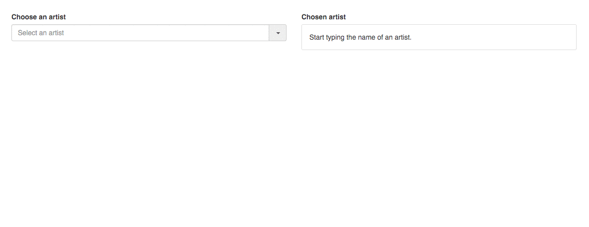
placeholder="Select an artist"}}
(...)
</div>
(...)
{{/auto-complete}}1 2 3 4 5 6 7 8 9 10 11 | |
This is needed when the item is autocompleted and the autocompleted segment is pre-selected so that the user can type over it if it’s not the item they had in mind:
1 2 3 4 5 6 7 8 9 10 11 12 13 14 15 16 17 18 19 20 21 22 | |
On the very last line, the component accesses the input directly, to select
(and highlight) the portion of the item that was autocompleted. That’s why we
need the whole registration process.
Since inputDidChange is triggered from the auto-complete-input component, we
could get rid of this direct coupling if there was a way to react to the
action’s result in the auto-complete-input itself. That way is called closure
actions.
Fire, but don’t forget
As opposed to the fire-and-forget nature of “ordinary” (aka. element) actions, closure actions provide a way to react to the action’s outcome at the source, where the action was fired from.
Since closure actions are functions, they can have return values. If the action triggers an async action, it’s best to return a promise from the upstream handler to which the event source can attach its handler to.
Let’s see how that works in our case.
1 2 3 4 5 6 7 8 9 10 11 12 13 14 15 16 17 18 19 20 21 22 23 24 25 | |
The code did not change a lot, but now a promise is returned on line 8. It is
resolved on 18, where start and end designate the cursor positions of the
selection.
The action handler in the auto-complete-input component needs to be modified
to set the selection higlight itself:
1 2 3 4 5 6 7 8 9 10 11 | |
Calling on-change will call the above inputDidChange function. Instead of
firing the (element) action and forgetting about it, we now call the (closure)
action and then “wait” for the resulting promise to be resolved. Once it does,
we set the selection range.
We could now remove all the registration code and the passing down of the autocomplete instance to the input component.
Remove the need for direct access to the list options
There is still another instance of the same. It serves to give access to the
autocomplete component to the auto-complete-option, through the
auto-complete-list.
<!-- tests/dummy/app/templates/index.hbs -->
{{#auto-complete
on-select=(action "selectArtist")
on-input=(action "filterArtists")
class="autocomplete-container" as |autocomplete isDropdownOpen inputValue
toggleDropdown onSelect onInput|}}
<div class="input-group">
{{auto-complete-input
value=inputValue
on-change=onInput
type="text"
class="combobox input-large form-control"
placeholder="Select an artist"}}
{{#auto-complete-list autocomplete=autocomplete isVisible=isDropdownOpen class="typeahead typeahead-long dropdown-menu" as |list|}}
{{#each matchingArtists as |artist|}}
{{#auto-complete-option
id=artist.id
label=artist.name
item=artist
list=list
on-click=onSelect
activeId=selectedArtist.id}}
<a href="#">{{artist.name}}</a>
{{/auto-complete-option}}
{{/each}}
{{/auto-complete-list}}
(...)
</div>
{{/auto-complete}}I am not copying all the registration code here as it’s very boilerplatey. Each
option, when inserted into the DOM, registers itself with its list, while the
list registers itself with the auto-complete component. The latter has an
options property to access the options:
1 2 | |
This access is needed to be able to cycle through the options by using the cursor keys and then select one of them by using the return key. Here is the code that handles keypresses (more precisely, keydowns):
1 2 3 4 5 6 7 8 9 10 11 12 13 14 15 16 17 18 19 20 21 | |
This is pretty simple so far. If a key we care about was pressed, we call the appropriate method to handle it. Let’s see how focusing works:
1 2 3 4 5 6 7 8 9 10 11 12 13 14 15 16 17 18 19 20 21 22 23 24 25 26 27 28 29 30 31 32 33 34 35 36 37 38 39 40 41 42 43 44 45 46 47 48 49 50 51 52 | |
focusPrevious and focusNext make sure that the focused index is kept within
the bounds of the avaiable number of options and then focus the previous (or
next) one by calling option.focus() directly (line 49).
There is one more key press concerning related to options, the return key. It should select the currently focused option, if there is one:
1 2 3 4 5 6 7 8 9 10 11 12 13 | |
This code also leverages the access to the options, indirectly through
this.get('focusedOption'). Furthermore, it assumes that each option has an
item and label properties. Not stellar.
It won’t be a piece of cake to get rid of direct coupling in all of these, so let’s get to it.
Change the focused option without accessing the options
In the first step, we’ll change the focused option without directly commanding the options to focus/unfocus. We’ll then tackle selecting the focused option.
We can use simple data binding to have the focused option available. By
maintaining and yielding a focusedIndex in the “control center”, the
autocomplete component, autocomplete-option components can bind to it and
know whether they are focused or not.
Here is how the templates need to change:
<!-- addon/templates/components/autocomplete.hbs -->
{{yield isDropdownOpen
inputValue
focusedIndex
selectedIndex
(action "toggleDropdown")
(action "selectItem")
(action "inputDidChange")}}<!-- tests/dummy/app/templates/index.hbs -->
{{#auto-complete
on-select=(action "selectArtist")
on-input=(action "filterArtists")
options=matchingArtists
displayProperty="name"
class="autocomplete-container" as |isDropdownOpen inputValue
focusedIndex selectedIndex
toggleDropdown onSelect onInput|}}
<div class="input-group">
{{auto-complete-input
value=inputValue
on-change=onInput
type="text"
class="combobox input-large form-control"
placeholder="Select an artist"}}
{{#auto-complete-list
isVisible=isDropdownOpen
class="typeahead typeahead-long dropdown-menu" as |list|}}
{{#each matchingArtists as |artist index|}}
{{#auto-complete-option
label=artist.name
item=artist
on-click=onSelect
isFocused=(eq focusedIndex index)
isSelected=(eq selectedIndex index)}}
<a href="#">{{artist.name}}</a>
{{/auto-complete-option}}
{{else}}
<li><a href="#">No results.</a></li>
{{/each}}
{{/auto-complete-list}}
(...)
</div>
{{/auto-complete}}Note the new focusedIndex and selectedIndex attributes, yielded by the
top-level component that isFocused and isSelected in the
auto-complete-option are bound to.
The eq helper comes from ember-truth-helpers and will evaluate to true if
its params are equal which is exactly what we want.
The autocomplete component needs to change to manage the new indexes instead
of setting its focusedOption and calling option.set directly:
1 2 3 4 5 6 7 8 9 10 11 12 13 14 15 16 17 18 19 20 21 22 23 24 25 26 27 28 29 30 31 32 33 34 35 36 37 38 39 40 41 42 43 44 | |
That is simpler and less intrusive than before. (Setting isDropdown to true
has been added as before the option’s focus method did the opening).
What’s missing is for the selected item to be sent to the outer world (in other
words, for the selectItem to be triggered). Before, it was done by sending
the selectItem action with the focused option’s item and label (see line 9 in
the last snippet of the previous section) but we can no longer indulge in
accessing the options directly. Consequently, it was replaced by setting the
selectedIndex to the focusedIndex (see line 40 above).
The problem now is that selectItem needs to be called with the item and the
label (the name of the selected artist to be set as the input’s value) and only
the selected auto-complete-option component has that knowledge. So we need to
set up a way for the auto-complete-option components to know when they become
selected and then call that action. As these components are not the source of
the event that lead to an option being selected by key press, we choose to use
an observer:
1 2 3 4 5 6 7 8 9 10 11 12 13 14 15 16 17 18 19 20 21 22 23 24 25 26 27 28 29 30 | |
Line 21 and 22 is where the option realizes it has become the selected option, and then calls the corresponding (closure) action on line 28.
We’re done, we got rid of all the direct passing of component instances, registrations and direct property access and method calling. Even though we’re Demeter compliant, there are things that could be improved.
In the next episode…
One of these things is the observer. Observers fell out of favor some time ago, and for a good reason. They can be over-eager and lead to scenarios where it is hard to see what’s going on. To prove my point, let me show you a bug I’ve just accidentally introduced. I call it the “JPJ is too good to be replaced” bug:
(The code for this series is publicly available on Github here. I’ve tagged where we are now with ccd-part-two.)
So we’re not done yet. In the next post of the series, we’re going to fix that bug by replacing the observer and make other worthy improvements. Stay tuned!